Color Schemes for Every Room: Cohesive Home Guide

Decorating with Color Schemes for Every Room: A Practical Guide
A cohesive color plan makes a home feel intentional, but the best results come from pairing color theory with real-room decisions: light levels, fixed finishes, and how each space is used. The goal isn’t to make everything match—it’s to make walls, furniture, textiles, and accents feel related, so the eye can move through your home without abrupt “resets” at every doorway.
Start with the room’s “non-negotiables”
Before picking paint chips, take inventory of anything that’s hard or expensive to change: flooring, countertops, large-format tile, built-ins, and major upholstery. These elements silently dictate what looks “right” in the space, so they should lead the palette rather than fight it.
Next, identify undertones. A surface can look neutral until it’s compared side-by-side with a true white and a true gray sample in the same lighting. If the material suddenly looks yellowed, rosy, greenish, or bluish, that’s your undertone cue (warm, cool, or neutral). This is especially important with quartz, marble-look counters, gray wood floors, and “greige” paints that can swing wildly depending on the room.
Then decide what the room must feel like and how it will function. A relaxing bedroom and a high-traffic kitchen need different contrast levels and different tolerance for bold color. Finally, choose a baseline neutral that supports the fixed finishes; neutrals are the glue that helps colors repeat across rooms without looking overly coordinated.
To keep the whole home from feeling like separate mini-projects, set one “repeat color” to carry through adjacent spaces. This can be a wood tone, a metal finish, or a soft neutral that shows up in lighting, frames, or textiles.
Pick a color scheme that fits the space
Color schemes are easier to manage when you treat them as structures. If you like color but worry about overwhelm, pick a framework first, then choose specific shades.
Color scheme cheat sheet
| Scheme | Best for | Common pitfall | Quick fix |
|---|---|---|---|
| Monochromatic | Small rooms, serene bedrooms | Looks flat | Add texture (bouclé, linen, ribbed ceramics) and one contrasting metal |
| Analogous | Open-plan areas, living rooms | Too much same-ness | Introduce a neutral break and one deeper “anchor” shade |
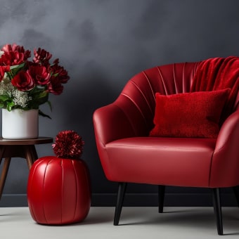
| Complementary | Statement rooms, creative spaces | Overstimulating contrast | Keep one color to accents (pillows, art) and soften the other |
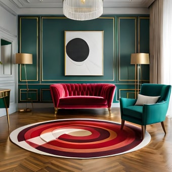
| Split-complementary | Dining rooms, family rooms | Competing accents | Choose one accent as the hero and keep the other to small repeats |
| Triadic | Kids’ rooms, eclectic homes | Feels primary/bright | Use dusty versions of the hues and add warm woods |
If you want to go deeper into the logic behind these relationships, references like Color Matters’ overview of the color wheel can help, and Pantone’s color system explanations are useful for understanding standardized color communication.
Build the palette: dominant, supporting, accent
A practical palette is less about the number of paint cans and more about clear roles. When every color has a job, the room feels layered instead of busy.
- Choose a dominant color family: Usually walls or the largest upholstered piece. This sets the emotional tone (airy, cozy, energetic, calm).
- Add a supporting color: Often rugs, drapery, or secondary upholstery. It should harmonize without matching exactly; think “same conversation, different sentence.”
- Choose one accent color: Artwork, pillows, vases, or one painted element. Accents look intentional when repeated 2–4 times around the room.
- Anchor with two neutrals: A light neutral for background and a mid-to-deep neutral for contrast. This prevents a scheme from feeling theme-like.
- Use a finish plan: Pick 1–2 metal finishes and repeat them. Mixing metals works best when undertones agree (warm with warm, cool with cool).
A simple mental model: dominant lives on big surfaces, supporting lives on medium surfaces, and accent lives on small, repeatable moments.
Room-by-room color planning
Living room
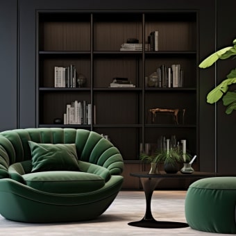
Prioritize comfort and continuity. Choose a wall color that behaves well both morning and evening, then add contrast through textiles and art rather than multiple bold paint colors. A deeper neutral (charcoal, deep taupe, soft black) in frames or lighting gives the room definition.
Kitchen
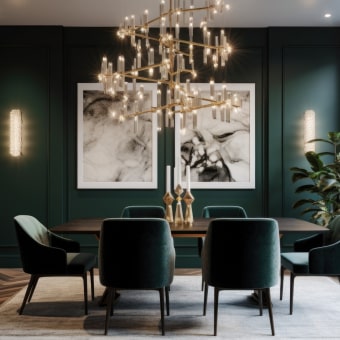
Dining room
Bedroom
Bathroom
Home office
Entryway and hallway
Lighting and paint: why swatches lie
Use large samples: test at least two options on poster boards and move them around the room to see how they behave in multiple light zones. Check undertones at night under the bulbs you actually use; if colors look sharp or gray, swapping to warmer bulbs can make the palette feel more natural. (Color perception is complex—resources like the CIE’s overview of color appearance phenomena explain why the eye interprets color differently across conditions.)
How to Choose the right digital color-scheme guide
Common color-scheme mistakes and fast fixes
FAQ
How many colors should be in one room?
A reliable approach is a dominant color, a supporting color, and one accent, plus one or two neutrals for balance. Patterns can count as multiple colors, so if a rug has several hues, keep the rest of the room simpler and repeat just one or two of those hues elsewhere.
How can a color scheme flow through an open-concept space?
Choose a shared neutral that appears across the whole space, then repeat one color in each zone (pillows in the living area, stools in the kitchen, art in the dining area). Vary saturation by zone—lighter in one area, deeper in another—and use rugs and lighting to define spaces without changing the entire palette.
What’s the easiest way to tell if a paint color has warm or cool undertones?
Compare the paint sample to a true white and a true gray in the room’s actual lighting; undertones become obvious when placed next to consistent references. Check it beside fixed finishes and view it both in daylight and at night under the bulbs you use most.


Leave a comment
You must be logged in to post a comment.